California
Education Levels in California Census Tracts
Select County:
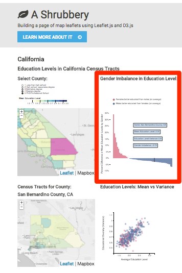
Gender Imbalance in Education Level:
Census Tracts for County:
Education Levels: Mean vs Variance
How to use this map
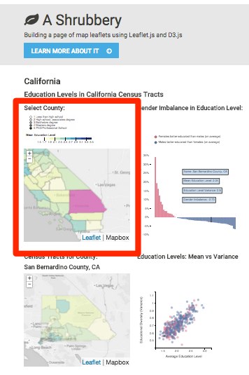
County Education Levels
Begin with the county map in the upper left hand corner. This map has a color overlay that represents mean education levels for that county (the data is from the US Census, via the Census Reporter API). The dark blue regions indicate areas that are, on average, more well-educated people, while yellow areas indicate that well-educated people are lacking.
As you hover over each county, you will see the corresponding bar on the bar chart on the right highlighted. When you click on a particular county, you can see that its bar is selected. You will also notice that when you click on a particular county, it loads a map of all census tracts in that county in the map below.
We'll cover the bar chart next.
Gender Imbalance in Education Levels
The bar chart labeled "Gender Imbalance" shows the imbalance in average education levels by gender. The census data from which this map was created broke down the population by education levels as well as by gender, so this allows for a mean education level to be computed for the total population (the quantity that is mapped on the left), as well as a mean education level for males and for females. The percentage difference in education levels between the two genders is plotted on the bar chart.
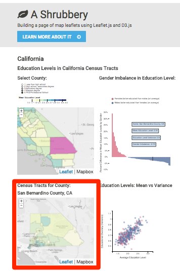
Census Tract Education Levels
In the bottom two maps, census data is broken down at a tract-by-tract level, rather than at the county-by-county level of the top two maps.
The map on the bottom has the same color scale as the map above, and shows the same quantity: the average education level for the population of that census tract. The census tract map shows a much finer-grained picture of how people of different education levels aggregate geographically.
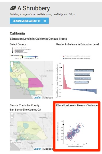
Education Level Means vs Variances
The scatter plot shows each census tract's mean education level versus the variance in education level. The variance gives a sense of the degree of diversity of a census tract. A tract that is more diverse is more likely to have pockets of people at every education level.