California
Commute Method by Povery Status for California Counties
This county-by-county map of California is clickable - try selecting a county.
The pie chart to the right displays the method of commuting to work for people living under the poverty line.
Select a County:
Footnote 1:
Commuter population is indicated by .
One additional person indicates an increase in number of commuters
of one order of magnitude.
The people icons are
logarithmic!
The basis is the smallest county, Alpine County, which has about 500 commuters. Since log(500) is about 6, we can subtract 5 from the log of every county's commuter population, and this gives us a good indicator, starting at 1, of the order of magnitude of that county's commuter population.
Turn into commuter populations with the formula:
Commuter Population = exp( 5 + )
While rounding logs leads to gross errors, like San Bernadino County getting 9 people, for a commuter population of exp(5 + 9) ~ 1.2 M, which is way off from its actual commuter population of 0.7 M, but is closer to 1.2 M (logarithmically speaking) than the next lowest interval, which is exp(5 + 8) ~ 0.4 M, in the end we must live with such approximations to have, in return, the convenience of digesting in a single glance such an immense amount of information.
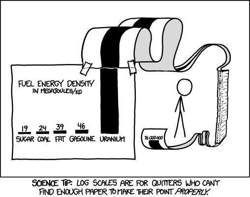
This is a good illustration of the problem of commuter population data and how multiscale it is: if we had one person represent a thousand people, Los Angeles County might require multiple pages of little people.

Key
= ~ 1,000 = ~ exp(5+2)
= ~ 8,000 = ~ exp(5+4)
= ~ 60,000 = ~ exp(5+6)
= ~ 400,000 = ~ exp(5+8)
= ~ 1,200,000 = ~ exp(5+9)
= ~ 3,200,000 = ~ exp(5+10)